Recruitment Metrics: The 12 That Diagnose a Broken Funnel (2026)
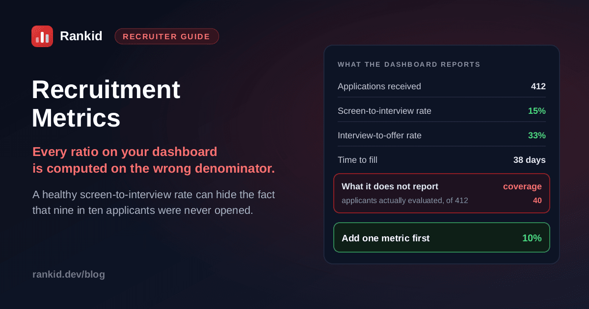
A recruiting dashboard can report a 15 percent screen-to-interview rate, a 33 percent interview-to-offer rate and a 38-day time to fill, all comfortably inside every published benchmark, on a requisition where 372 of 412 applicants were never opened. Nothing on the dashboard is wrong. Every ratio on it is simply computed on a denominator that nobody chose, and the biggest failure in the funnel is the one number the funnel cannot see.
Quick answer
What are recruitment metrics, and what is a KPI?
Recruitment metrics are the numbers describing your hiring process: volume in, conversion between stages, time per stage, cost, and how the resulting hires performed. Recruitment KPIs are the small subset you have actually committed to being judged on.
That second distinction gets skipped and it matters. If twenty metrics are all KPIs then none of them are, because nothing can be prioritised when everything is important. Most teams are well served by three or four KPIs with the rest held as diagnostics you consult when a KPI moves. The more useful split, though, is not metrics versus KPIs. It is levels versus diagnostics.
- A level is a count or a single figure: 412 applications, 6 interviews, $4,560 per hire. It reports. It cannot tell you what to do.
- A diagnosticis a ratio or a trend: what share of applicants you evaluated, whether cost per hire is falling across requisitions, which stage's pass-through rate is the outlier. It points at a stage.
Nearly every weak recruiting report is a wall of levels. It answers “what happened” and goes quiet on “what is broken”.
The metric almost nobody tracks, and why it breaks the others
Here is the structural problem with standard recruiting reporting, and it is not a rounding issue. Take the requisition from the top of this article. 412 people applied. A careful evaluation takes about 90 seconds, the recruiter is carrying five other reqs, and the reading stopped around applicant 40. Six people were interviewed.
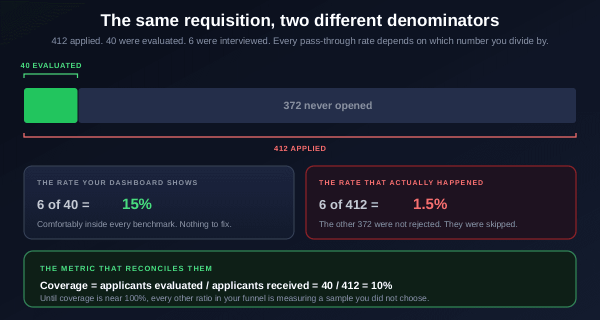
Both rates are arithmetically correct. The 15 percent figure describes the sample the recruiter got through; the 1.5 percent figure describes what happened to the people who applied. And the 372 in the gap were not rejected, which is the part that matters for measurement. Rejection is a decision that produces information. Being skipped produces none, so those applicants are invisible to every metric you have.
Coverage is the fix, and it is trivially easy to calculate: applicants evaluated divided by applicants received. Nobody reports it, and until it is near 100 percent every other ratio in your funnel is measuring a sample selected by whoever ran out of time. It is also the metric that explains the most common complaint in recruiting analytics, which is a dashboard that looks fine while hiring feels broken.
Coverage is a data-quality metric, not a virtue metric
Turn every reported number into one that diagnoses something
You probably already collect most of what you need. The upgrade is usually a reframe rather than new instrumentation:
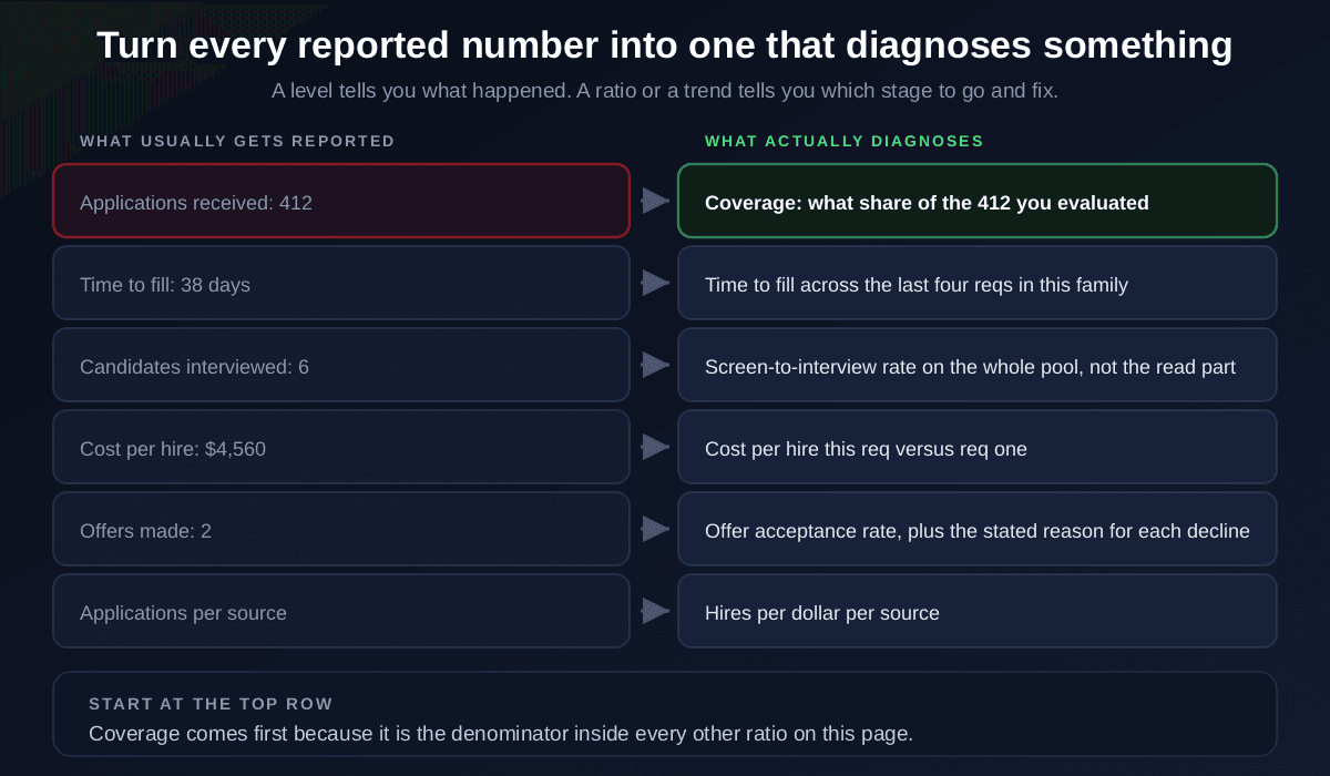
Two patterns do most of the work here. Replace a count with the ratio that has it as a numerator, and replace a single figure with the same figure across the last four comparable requisitions. Neither requires new tooling, and both convert a report into something you can act on.
The 12 recruitment metrics worth tracking, by stage
Grouped by the stage they diagnose, so a bad number tells you where to go rather than just that something is wrong.
Attract: is the top of the funnel doing its job?
1. Applications per requisition. Context for everything else, and useless alone. 2. Source yield, meaning hires per dollar per channel rather than applications per channel, which is the number that should set next quarter's spend. See candidate sourcing. 3. Application completion rate. If a large share start and abandon, your form is the problem, not your advertising.
Evaluate: the stage where most funnels actually break
4. Coverage. Applicants evaluated over applicants received. Target 100 percent, and fix this before you trust anything below it. 5. Screening throughput, resumes evaluated per recruiter hour, which is the capacity number behind coverage. 6. Screen-to-interview rate, computed on the whole pool. Roughly 10 to 25 percent is commonly cited; the value is in the outlier, not the range. Mechanics in how to screen resumes in bulk.
Decide: is the process converting and moving?
7. Interview-to-offer rate. Low usually means the screen is passing people it should not; see the screening interview guide. 8. Offer acceptance rate, with the stated reason for every decline recorded, because the reasons are the actionable part. 9. Time to first response. The only metric on this list candidates experience directly, and the one that moves candidate experience most.
Outcome: did it work, and is it improving?
10. Time to fill and 11. cost per hire, both as trends across comparable requisitions rather than single figures, since the trend is the evidence of a functioning system. Definitions and the internal-cost trap in cost per hire. 12. A quality-of-hire proxy, commonly 90-day or 12-month retention plus a short hiring-manager satisfaction check. Imperfect, and better than nothing, which is the usual alternative.
One cross-cutting measure sits outside this list and belongs on the same dashboard: selection rate by stage, broken down by group. It is how you catch a stage quietly passing one group at a much lower rate, calculated using the four-fifths method in adverse impact and argued at the process level in diversity hiring.
Get coverage to 100% and the rest of your metrics start meaning something
Upload your full applicant batch and paste the job description. Rankid scores every candidate 0 to 100 against the role's criteria, with the skills and keywords each one matches and misses, so your pass-through rates are computed on everyone who applied rather than the 40 you had time for. Up to 200 resumes per batch, first 5 free, no signup.
Evaluate your whole pool freeRecruitment funnel metrics and how to read them backwards
Recruiting funnel metrics are just the pass-through rates between consecutive stages. Their value is comparative: one unusually low rate localises a problem far better than any overall figure, because each stage has different causes.
They are also the only honest way to answer “how many applicants does this role need?” Work backwards from one hire. If roughly one in three offers is declined, one in three interviews produces an offer, and one in six evaluated candidates reaches interview, then one hire needs somewhere around 54 genuinely evaluated candidates. That arithmetic is what turns a hiring target into a sourcing plan, and it is the same reasoning behind high-volume recruiting and workforce planning.
The caveat is the one from earlier and it is worth repeating because it invalidates the whole calculation: a funnel rate is only meaningful if the stage above it processed everybody. Multiply four rates together where one has a truncated denominator and you get a confident number that describes nothing.
Recruiting metrics benchmarks, and why they mislead
Published benchmarks are the most requested and least useful artefact in this field. Three reasons to treat them as a sanity check rather than a target:
- They blend incompatible things. A single time-to-fill figure across industries, seniority levels, geographies and company sizes describes no actual hiring situation. Being outside the range usually reflects your role mix.
- They are trivially gameable, often accidentally. Time to fill improves if you start the clock at posting rather than at approval. Cost per hire improves if you stop counting recruiter hours, which is exactly the line most teams already omit.
- Your own trend is strictly better. Comparing this requisition to your last four comparable ones holds the confounders constant, which no external benchmark can do.
If a metric improved, check the definition did not
Building a recruitment metrics dashboard
One screen, about eight numbers, each with an owner and a review cadence. Dashboards fail by being comprehensive: thirty tiles get glanced at, eight get acted on.
- Coverage of the applicant pool, per open requisition.
- The three pass-through rates: screen-to-interview, interview-to-offer, offer acceptance.
- Time to first response.
- Time to fill and cost per hire, each as a trend across the last four comparable reqs.
- Selection rate by stage, split by group.
- One quality-of-hire proxy, reviewed quarterly rather than weekly.
Review monthly at requisition level and quarterly at trend level, and ask one question of the trend view: is this getting cheaper and faster than it was four requisitions ago? That is the compounding test described in talent acquisition strategy, and metrics are how you answer it rather than guess at it.
Where recruitment metrics programmes go wrong
- Reporting levels and calling it analytics. Applications received and interviews held describe activity. Neither can be acted on.
- Ignoring the denominator. The single biggest error, and the reason a dashboard can look healthy on a requisition where most applicants were never opened.
- Tracking twenty KPIs. Which means having none. Pick three or four and demote the rest to diagnostics.
- Benchmarking instead of trending. External ranges are noisy; your own history is not.
- Measuring without changing capacity. Discovering that screening is the bottleneck and then adding a report about it changes nothing. Fixing coverage requires removing the constraint, which is the argument in recruitment automation.
Key takeaways
- Recruitment metrics split into levels, which report, and diagnostics, which point at a stage to fix.
- Coverage, the share of applicants actually evaluated, is the hidden denominator inside every pass-through rate.
- A 15% screen-to-interview rate on the 40 you read and 1.5% on the 412 who applied are the same requisition.
- Skipped applicants are not rejected applicants: they produce no data at all, so they are invisible to your dashboard.
- Read time to fill and cost per hire as trends across comparable reqs, never as single figures.
- Use benchmarks as a sanity check and your own trend as the target, since benchmarks blend incompatible situations.
- Rankid scores up to 200 resumes per batch against one job description. First 5 free, no signup.
Bottom line: most recruiting teams do not have a measurement problem so much as a denominator problem. The numbers are collected honestly and they describe the portion of the work that got finished, which is precisely the portion least likely to contain the failure you are looking for. Add coverage, read everything else as a ratio or a trend, and the dashboard stops reassuring you and starts pointing somewhere. Score your next full applicant batch with Rankid and give your metrics a denominator worth dividing by.
Frequently asked questions
What are recruitment metrics?
Recruitment metrics are the numbers you use to describe and diagnose your hiring process: how many people applied, how many were evaluated, how they converted between stages, how long each stage took, what it cost, and how the hires performed afterwards. The useful distinction is between levels and diagnostics. A level, such as applications received, tells you what happened. A ratio or a trend, such as the share of applicants you actually evaluated or cost per hire across four requisitions, tells you which stage to go and fix. Most recruiting reporting is heavy on levels and light on diagnostics, which is why it can look healthy while hiring feels broken.
What is the difference between a recruitment metric and a recruitment KPI?
A metric is anything you measure. A KPI is the small subset you have agreed to be judged on and act upon. The practical difference is commitment: you can track twenty metrics, but if all twenty are KPIs then none of them are, because nothing gets prioritised when everything is important. Most teams are well served by three or four recruitment KPIs, typically coverage of the applicant pool, time to fill, cost per hire and offer acceptance rate, with the remaining metrics kept as diagnostics you consult when a KPI moves.
What are the most important recruitment metrics to track?
Track coverage first, meaning the share of applicants who were actually evaluated against the job, because it is the denominator hiding inside every other ratio. Then the funnel pass-through rates: screen-to-interview, interview-to-offer and offer acceptance. Then the two the business already understands, time to fill and cost per hire, both read as a trend across requisitions rather than as a single figure. Then time to first response, which is the metric candidates actually experience. If you only ever fix one number, fix coverage, because a partially read pool makes every other rate on this list a measurement of a sample you did not choose.
What are recruitment funnel metrics?
Recruitment funnel metrics are the pass-through rates between consecutive stages of hiring: application to screen, screen to interview, interview to offer, and offer to accepted hire. Multiplying them gives your overall application-to-hire conversion, and dividing backwards from a target number of hires tells you how many applicants each requisition actually needs. Their diagnostic value comes from comparing stages, since one unusually low rate localises the problem far better than any overall number. The critical caveat is that a funnel rate is only meaningful if the stage above it processed everybody, which at the screening stage is frequently untrue.
What is a good screen-to-interview rate?
Commonly cited ranges sit somewhere around 10 to 25 percent of screened candidates advancing to interview, but the range matters less than what an outlier tells you. A rate well below that usually means your shortlist was built by skimming rather than by measuring candidates against the job, so people are reaching the call who should have been filtered on paper. A rate well above it usually means the screen is not filtering at all, either because you only called certainties or because the call has no real questions in it. Also check the denominator: a healthy-looking rate computed on the 40 resumes you read rather than the 412 you received is not telling you what you think.
Should you use recruiting metrics benchmarks?
Use them as a sanity check, never as a target. Published benchmarks blend industries, seniority levels, geographies and company sizes with wildly different hiring dynamics, so being outside a range often reflects your role mix rather than your performance. They are also easy to game unintentionally: time to fill improves if you start the clock later, and cost per hire improves if you stop counting recruiter hours. Your own trend across comparable requisitions is a far more reliable standard than any external figure, because the confounders stay constant.
What should a recruitment metrics dashboard include?
Keep it to one screen and roughly eight numbers. Coverage of the applicant pool, the three funnel pass-through rates, time to first response, time to fill and cost per hire shown as trends across the last four comparable requisitions rather than as single figures, and selection rate by stage broken down by group for fairness monitoring. Anything else belongs in a drill-down. Dashboards fail by being comprehensive: a screen with thirty tiles gets glanced at, whereas eight numbers with a stated owner and a review cadence actually get acted on.
Why do recruitment metrics look fine when hiring feels broken?
Almost always because the metrics describe the part of the process that was completed rather than the part that was attempted. If 412 people apply, 40 are read and 6 are interviewed, then screen-to-interview looks like a healthy 15 percent, while the true application-to-interview rate is 1.5 percent and 372 people were skipped rather than rejected. Nothing on a standard dashboard reveals that, because applications received and candidates interviewed both look normal. Adding coverage as an explicit metric is what makes the gap visible.